
Agile Team
Create your own agile team by forming right set of resources skilled in specific streams.
Empowering organizations with robust and scalable enterprise applications tailored to the needs
Harnessing the power of artificial intelligence to drive innovation and boost efficiency
Creating high performance and engaging digital commerce solutions to maximize the business
Seamlessly integrating technologies to build cohesive and efficient IT infrastructures
Streamlining operations and boosting productivity with custom business automation solutions
Turning data into actionable insights with our advanced BI and analytics development service
90+
1998
7000+
3000+
Our learning from variety of industries over more than two decades have helped us bring immediate impact.

Discovery Workshop
Define functional scope of your project to plan project budget and timeline.
Sculpting modern, dynamic web applications for a digital-first world
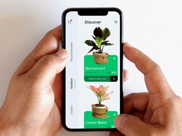
Designing high-performing mobile apps for a connected future
Leveraging AI & ML to Deliver innovative solutions
Enhancing experience with intuitive and user-centric design services
Streamlined Processes and Collaboration for code lifecycle
Delivering excellence with robust automated and manual QA
Leveraging the device ecosystems to build a connected world
Crafting result-driven strategies to propel your business forward

Popular Brands
A gallery of astonishing solutions delivered to the most recognized brands.

Case Studies
Explore how IndiaNIC delivered IT Solutions to Startups & Enterprises.
Our Work
A glimpse to our expertise in design, development & industry experience.
Products
Digital tools developed by us for businesses to be more productive.

GenAI & AI Agents
Automate and innovate with intelligent AI solutions for modern enterprises.
-

-
- Home Services
-
Web Development
-
Mobile Apps
-
AI / ML
-
UI/UX Consultancy
-
DevOps
-
QA
-
IoT
-
Marketing
-
- Home Methodology
-
Discovery
Transforming ideas into a measurable scope with functional UI/UX Design.
-
Project Execution
Get to know how we balance the critical triangle of Cost, Time and Scope.
-
Dedicated Developers
Form an expert team who works remotely, under your supervision.
-
Project Review
Proactive review at every stage for the efficient delivery.
-
- Home Work
-
Popular Brands
A gallery of astonishing solutions delivered to the most recognized brands.
-
Case Studies
Explore how IndiaNIC delivered IT Solutions to Startups & Enterprises.
-
Our Work
A glimpse to our expertise in design, development & industry experience.
-
Products
Digital tools developed by us for businesses to be more productive.
-
- Home Ai
-
Custom AI Services
Smart AI solutions designed to automate tasks, improve strategies, and maximize impact.
-
NLP Solutions
Improve communication, streamline support, and extract insights with cutting edge NLP.
-
Computer Vision Services
Unlock intelligent automation with AI powered image recognition, video analytics, and facial recognition.
-
Generative AI Solutions
Unlock creativity and personalization with AI driven content and intelligent recommendations.
-
Data Science & Analytics
Convert raw data into strategic insights that fuel growth.
-
AI Tech Stack
We utilize cutting edge AI, ML, and deep learning technologies to drive innovation.
-
AI Agents
Enhance efficiency by automating processes, customer engagement, and decision making with AI Agents.
-
AI Operations (AI Ops)
AI driven IT operations: smarter insights, automated workflows, and predictive capabilities.
-
Machine Learning Development
Delivering custom ML models and predictive analytics to drive business success.
-
AI & Machine Learning Overview
Explore how AI and ML can transform operations and drive business growth.
-
AI-Driven Business Transformation
Redefine your business strategy, increase productivity, and explore new revenue potential with AI.
-
AI & ML Model Expertise
Utilize advanced AI and ML models supervised, unsupervised, and deep learning to tackle complex challenges.
Well, this is unexpected...
Explore our services
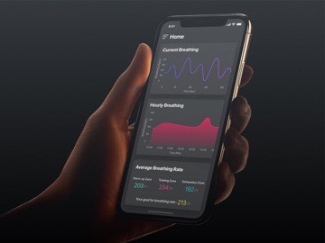
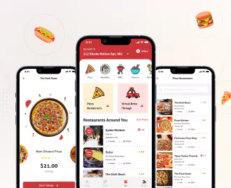
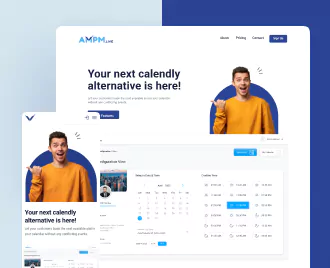
Leaders in creating appealing and engaging apps for smartphones that meet business goals and user needs.
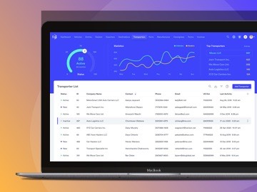
Focused on solving complex problems on the web with clear and effective solutions that enhance brand value.
Our designers work directly with clients to deliver compelling and functional designs in various forms.

Delivering large applications at the pace of your business with our Agile DevOps services.

Creating impactful, innovative and user-centered applications leveraging the Internet of Things (IoT).

A studio full of geeks, artists and freaks who know how to produce playful entertainment.

We help businesses add intelligence to their ecosystem with AI-ML powered solutions.

We don’t just test, we help your product succeed with faster releases and uncompromised quality.

Create your own team of software developers by hand-picking experienced members.